In January, I published a post – Top 5 Interior Design Trend’s In 2016 – for the Srote & Co Architects company blog. With this year almost behind us I thought it would be fun to take a look back at the trend forecast and see which ones made their way into our interiors and which ones I missed the mark on.
ECLECTIC INTERIORS
Eclectic design relies heavily on the building blocks of design (color, pattern, texture, and composition) to make a space look cohesive. People typically associate eclectic design with a chaotic mix of objects that all colliding in one space, so there is some hesitation in the design community to use this term when describing a desired aesthetic. This hesitation has brought about design styles such as Modern Farmhouse and Rustic Chic. While these classifications do describe the styles being combined, by definition, any time you combine more than one design style, it is eclectic.
UPDATE: Our interiors are as unique as we are. We will continue tailor the architectural and interior designs of our residences to match our personalities and lifestyles for years to come.
ARTISAN GOODS
Being socially and environmentally aware is no longer a trend, but a way of life. Fair Trade practice is an example of this growing awareness. This is a social movement with a goal to help developing countries achieve better trading conditions and promote sustainability. The items produced are specific to the region they are sourced from and handmade by local artisans. As an interior designer, I am always looking for one-of-a-kind items for my clients and have embraced this direction in design. Unique pieces from around the globe and locally sourced handmade items will be making their way into our homes in 2016.
UPDATE: This is definitely not a fad. Even retailers, such as Pottery Barn, highlight Fair Trade products on their websites today.
MIXING METALS
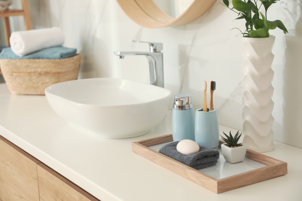
Metallics add warmth and richness to any space. The interior design trend is definitely leaning toward the warmer tones of copper, brass and rose gold. Silver, pewter and chrome are still in the mix, but are no longer the only metals in the room. This trend is about more than just mixing the metals; it’s about mixing their textures and sheens as well. These metals are no longer offered only in polished or brushed. Look for matte, burnished, antiqued and other designer finishes to be introduced to the market.
UPDATE: Metal did not perform as expected this year. While it was exciting to see the fun tabletop decor that first flooded the market, it didn’t really go anywhere from there.
NEUTRAL
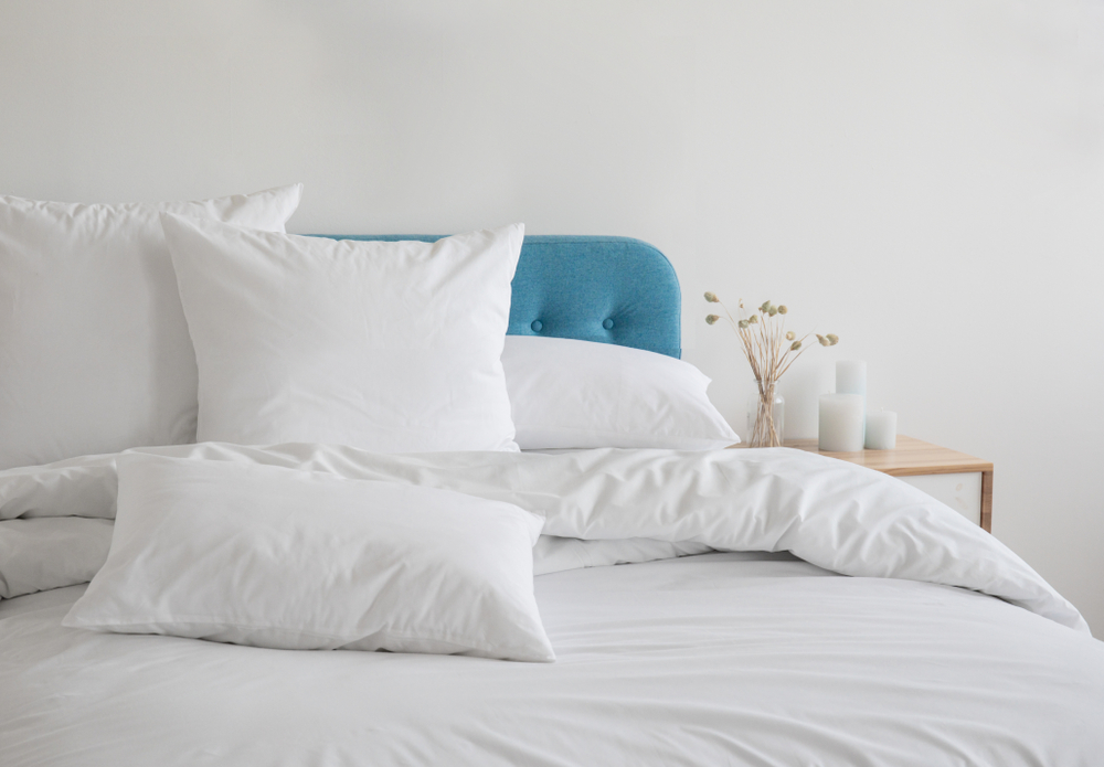
Sherwin Williams and Benjamin Moore announced their “2016 Color of the Year”, and in stark contrast to last year’s selections, Coral Reef (SW) and Guilford Green (BM), this year, both selected a shade of white. These may seem like controversial selections from paint companies that, when combined, offer over 4500 paint colors. However, when you look at the entire color palette presented from both Benjamin Moore and Sherwin Williams you get a better grasp of the reasoning behind their selection. They are in no way suggesting we live in a white box. These colors merely serve as a backdrop to let certain features take center stage. Bold graphic designs, brightly accented walls surrounded by white trim and neutral backdrops highlighting the natural elements in a room are what this trend is about.
UPDATE: There is nothing stopping this train. Hang in there. This one is here to stay.
PATTERNS
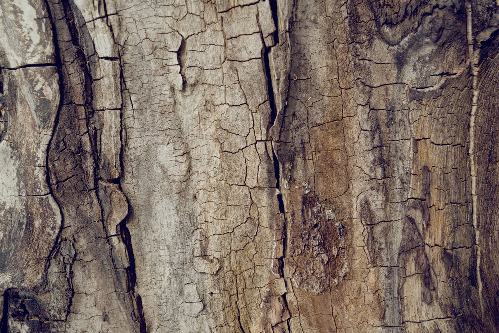
With our walls taking on neutral tones, the opportunity to introduce visual interest will present itself in home accents. Bright graphic prints on accent pillows, area rugs and artwork is a great place to start. Geometric patterns are already saturating the market in wallpaper, flooring and backsplashes. Selecting the correct patterns and textures to accomplish your design goals can prove challenging and is best done in person if possible.
UPDATE: A swing and a miss on this one! Like metal it came on strong and then didn’t really have anywhere to go. Texture ruled over pattern and I think I see that trend continuing. But as well all know I have been wrong before, LOL!
Do you think I got it right or wrong?
Did you embrace any of these trends this year? We would love to see how you incorporated them into your decor.
Check back next month for our 2017 Interior Design Trend Forecast!
