I was contacted by a local publication, St. Louis Homes & Lifestyles, to weigh in on their Classic vs. Craze section for an upcoming issue. The subject – “Mediterranean Tile in the Bathroom.” Do you see it as a timeless element or will it fade as quickly as it became a trend? For me it is definitely a “Classic”.
A BRIEF HISTORY
Mediterranean, or encaustic, tiles have been produced and used since the late 19th century throughout urbanized areas of the Mediterranean, using the same techniques invented by the Arabs over ten centuries ago. These tiles have truly stood the test of time. With today’s interiors trending towards white and grays I can certainly see why these tiles are making their way into our kitchens and baths.
Today’s Popularity
We are currently surrounded in white. White cabinets, white countertops, white shiplap, white trim….. Don’t get me wrong, I think that look is beautiful but not many of us live a lifestyle that affords us the time or energy to maintain that pristine look you saw on the cover of your favorite magazine. Using a tile with color and pattern make these spaces feel more inviting and livable. In kitchens and bathrooms in particular, we as designers are faced with the unique challenge of incorporating essentially all hard surfaces making the need for textural interest even more important.
THINGS TO CONSIDER
Even a classic element can be a trend! If you are considering these tiles due to the current exposure they are receiving on your favorite TV show or magazine, you may want to sit this one out. It is also important when selecting your tile that you are sticking with the style and architecture of the space you are using it in. If you decide to embrace this timeless element the possibilities are endless and the impact is undeniable.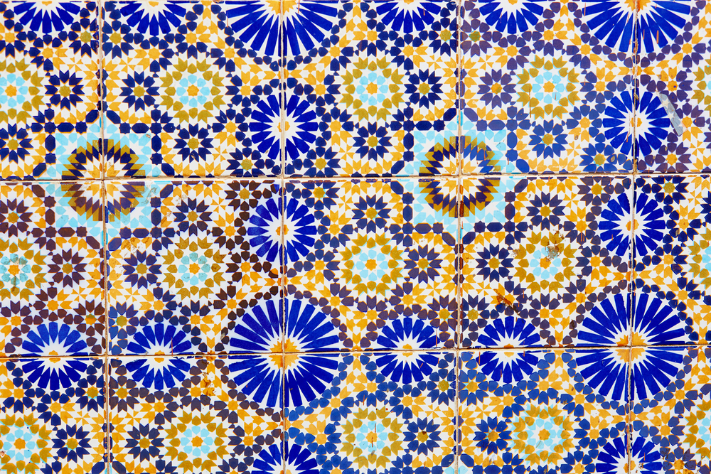
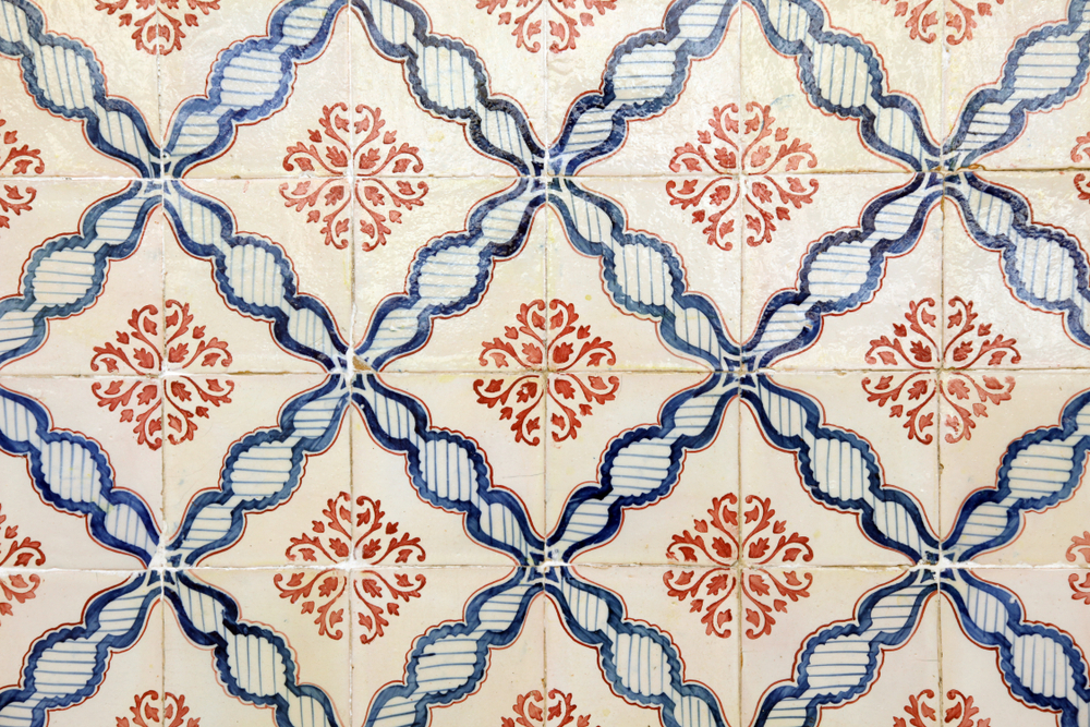
Have you used this type of tile in any of your spaces? We would love to see your photos!
