The Principles of Design – Unity & Harmony

Have you ever walked in a home where each room had its own color scheme or style? It can feel a bit overwhelming and disjointed. Many of my clients may not have a clear vision of what they want their space to look like they always tell me they want it to feel cohesive and inviting. With the direction in new construction over the last 10 years leaning towards large open spaces versus the separate, clearly defined rooms of the past, unity and harmony are move important than ever.

UNITY & HARMONY

Unity in design occurs when the elements in a space work together in such a way that the resulting look is balanced and harmonious. It is difficult to achieve unity without harmony.  Harmony is accomplished by the repetition of a particular design element, such as color, shape, texture, etc… that harmony is what creates the sense of unity. DIY’ers beware, too much unity in a room can lack personality and interest.

So what do unity & harmony look like in interior design?
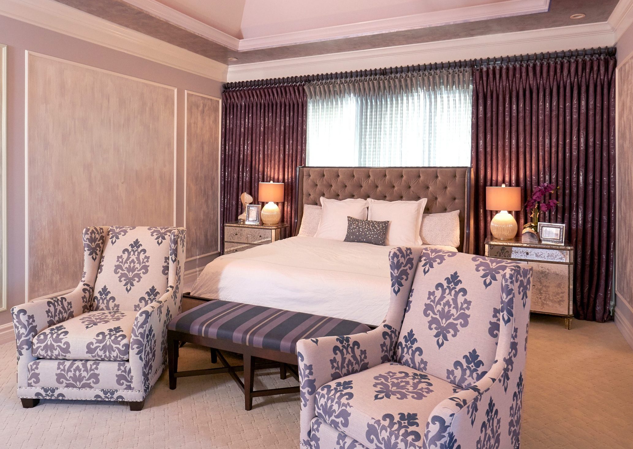
bedroom with custom furnishings and drapery

Designed by Srote & Co

Using the same color in different intensities and items in a similar scale give this room a restful feel with visual interest.

Make sure to visit SroteCo.com to see how we incorporate unity and harmony everyday into our own projects.
2017 Color of the Year Forecasts

What a difference a year makes! Every year the leading paint companies release their color trend predictions for the upcoming year. Last year we saw a white from both Benjamin Moore and Sherwin Williams, a blush pink and purple from Pantone and an aloe green from PPG. While none were exactly the same they all had a light fresh quality about them. This year, all bets are off!

PANTONE’S COLOR OF THE YEAR

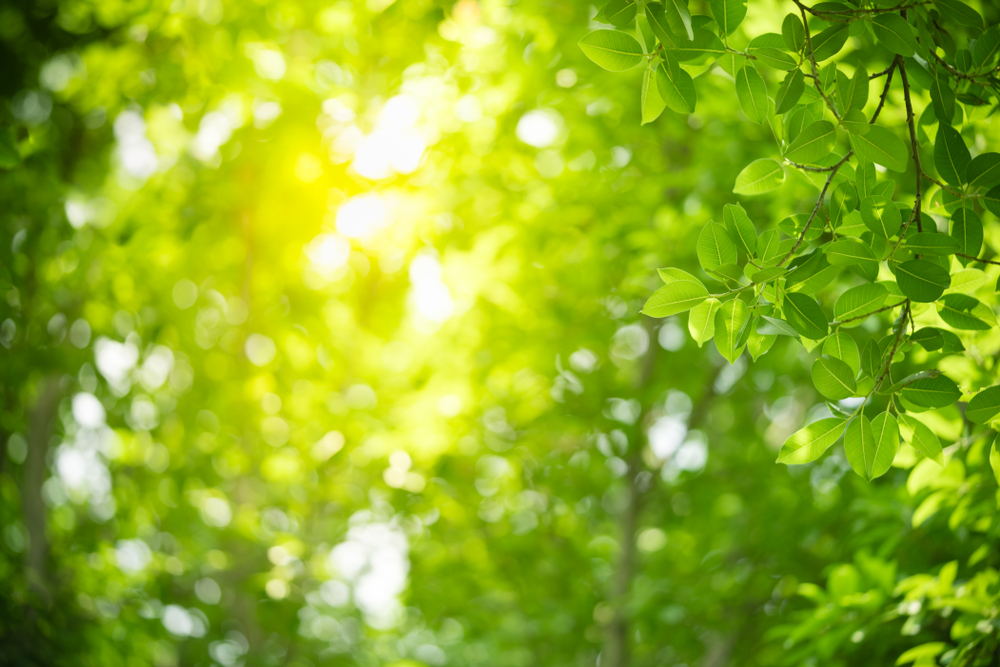
REFRESHING. REVITALIZING. NEW BEGINNINGSlight shining through trees

Greenery is described as “a fresh and zesty yellow-green shade that evokes the first days of spring when nature’s greens revive, restore and renew.”

SHERWIN-WILLIAMS COLOR OF THE YEAR

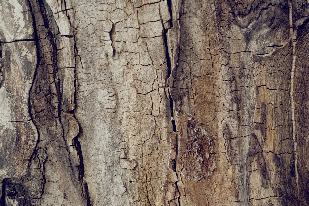
MODERN. CLASSIC. NEUTRALwood bark on a tree

Poised Taupe is an earthen brown combined with conservative grey and the result is a weathered, woodsy and complex neutral that celebrates the imperfections and authenticity of a well-lived life.

BENJAMIN MOORE COLOR OF THE YEAR

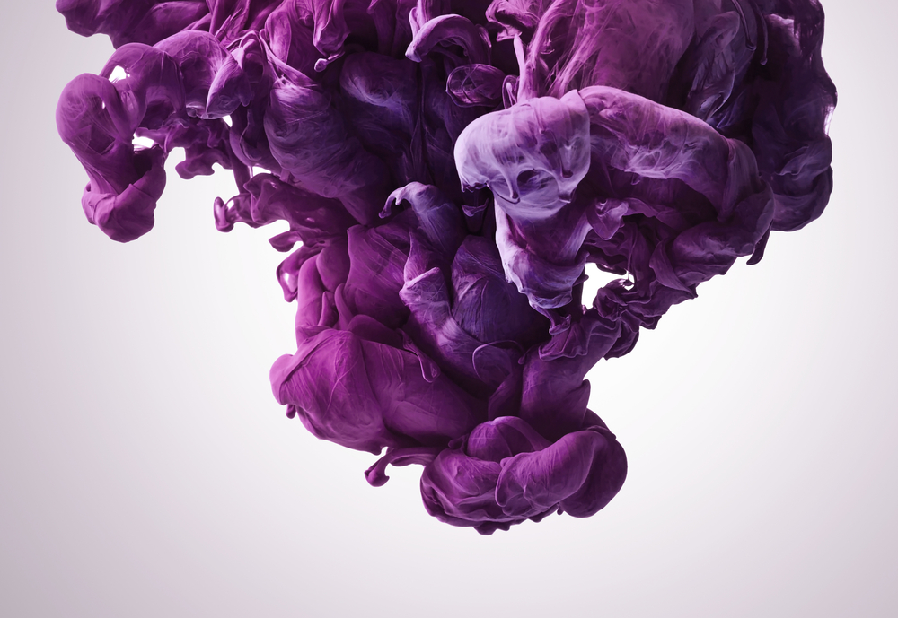
MYSTERIOUS. PASSIONATE. ALLUSIVE.purple ink

Benjamin Moore Creative Director, Ellen O’Neill, described Shadow as sophisticated, provocative and poetic, it can bring energy to a space or harmony and a moment of respite.

PPG COLOR OF THE YEAR

DEPTH. LUXURY. PAMPERING.evening sunset

Violet Verbena is a moody purple with a chameleon-like presence that adapts to surrounding environments and complements a variety of design aesthetics, from playful rooms to tranquil spaces.

We would love to know you thoughts on the 2017 color forecasts. Which do you love? How will you use it?

For inspiration on how to incorporate these colors in your interiors check out our 2017 Color Trends Board on Pinterest.

Sherwin Williams 2017 Color Forecast

Every year I look forward to Sherwin-Williams ColorMix, hosted in St. Louis, at KDR Designer Showroom. This event is the official unveiling of the projected color trends for the upcoming year. I was so inspired by the presentation I thought it would be fun to share the 4 palettes with you.

NOIR

It’s among our most precious commodities: night. We’re craving a refuge from urban streetlights and glowing screens, space to turn our gaze inward and recharge the spirit. Mindful melancholy is fueling a new romanticism marked by medieval patterns, revived customs and bittersweet beauty. The Dutch masters knew the secret: dark hues set a dramatic stage for sensuous luster. This palette is rich with vine-ripened fruits, Nordic blues, moody neutrals and golden yellows.

HOLISTIC

Sustainable design and radical transparency are the new standards. As our daily transactions move further into the cloud, acquiring experiences is becoming preferable to buying more things. “Doing good” is the new looking good, and it’s taking the form of “voluntourism,” healing retreats and eco-travel. We’re in pursuit of an elusive ideal: a fair luxury. The roads of this journey are lined with arctic neutrals, blush rose and wild browns.

INTREPID

The virtual and the real are blurring in the form of seamless commerce and “office anywhere” collaboration. Impatient for social and political change, we’re reinventing ourselves first. Identity has never been more fluid. “You do you” is the mantra of a generation primed for self-expression, cheered on by their own #squad and tossing aside old categories. There’s a feisty energy to our present moment, arriving in fiery tones and vibrant, kimono colors.

UNBOUNDED

Global immigration is redefining borderlands, national identity and our sense of coexistence. We’re all citizens of the world now. Brands are becoming more purpose-driven, communities more connected. Design is adapting to more diverse populations. Overconsumption is, well, over. We’re more likely to invest in the best we can afford — crafted and customized — and then keep it forever. Global consciousness is a mural painted in earthy mustards, ocean blues, corals and mud.

Visit Srote & Co on Pinterest to view our boards dedicated to each palette.

The New Neutral

Over the past year or so, it seems like dark green interiors have been popping up left and right and the hue shows no signs of slowing down. It is one of the top design trends predicted for 2017. Think of it as the “new navy.”

This moody color works well with both traditional and modern decor. Working as a dramatic neutral it really pairs well with almost ANY color.  However, it truly shines when paired with other neutrals.  Add in beautiful wood tones, camel leather, natural linens and warm brass tones for a winning combination.

This is certainly a color you need to test out before making a final selection. As you should always do, purchase a few sample colors and paint large squares on each wall of the room. Live with it for a couple days and take note of how the color looks throughout the day. Different lighting conditions will greatly affect how the color reads in your home. For a more reserved take on the trend, paint a piece of furniture or add a pop of the color using a piece of art or pillow!

So what is your take on this color? Love it? Hate it? Sound off in the comments!

Trend Watch – Welcome To The Jungle

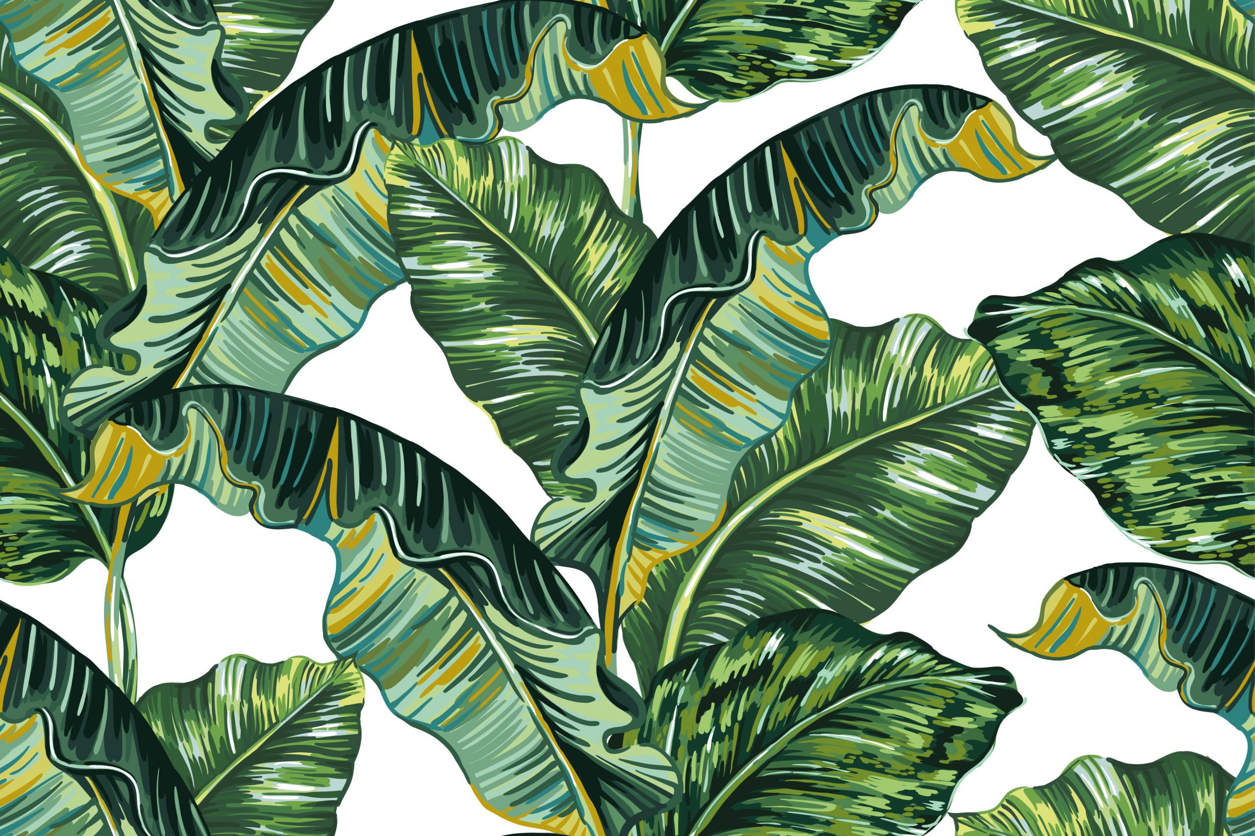
banana leaf printI don’t know about you but I am currently loving the resurgence of this tropical trend in decor and accessories. And its a good thing because I can’t open a magazine or my Instagram feed without being overwhelmed with designs or accessories embracing this element.
DON’T CALL IT A COMEBACK

The banana leaf was made popular in the 1940’s when decorator Don Loper designed and installed over 5 1/2 miles of the now iconic, Martinique wallpaper, in the Coffee Room and the hallways at The Beverly Hills Hotel. At the same time Dorothy Draper was beginning a major renovation at The Greenbrier Hotel in West Virginia giving us the iconic Brazilliance wallpaper. Truly standing the test of time, the wallpapers remain in both hotels today.

FASHION & DECOR COLLIDE

While there used to be an almost 5 to 6 year lag from the runway to interior showrooms we now see an immediate correlation between the two. This is due mostly to the popularity of blogging, social media and communication between the creative minds in each respective field. Today you can find banana leaves on everything from iPhone cases to swimwear.

What are your thoughts on this tropical inspired trend? We would love to see how you are embracing this in your everyday life!

Masculine Interiors

With Father’s Day quickly approaching, we find ourselves thinking of all the important men in our lives and how we can make their day special.  Perhaps a relaxing, well-designed sanctuary could be the perfect gift.  Today we’re discussing the three main elements that shape a stylish masculine space and we’ve included some great pieces to incorporate.

Neutral Palette

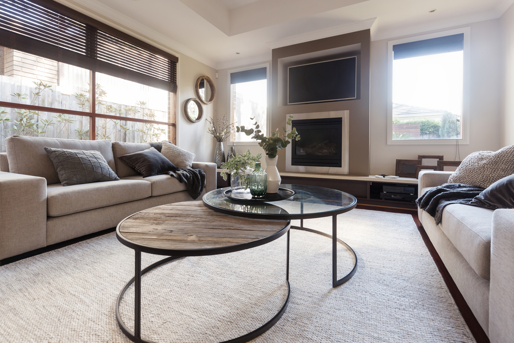
Neutrals and earth tones are great for a more masculine interior.  Create a classic look by using a neutral color palette to set the tone, then layer in color and pattern through artwork and accessories.neutral interior design

Simplicity

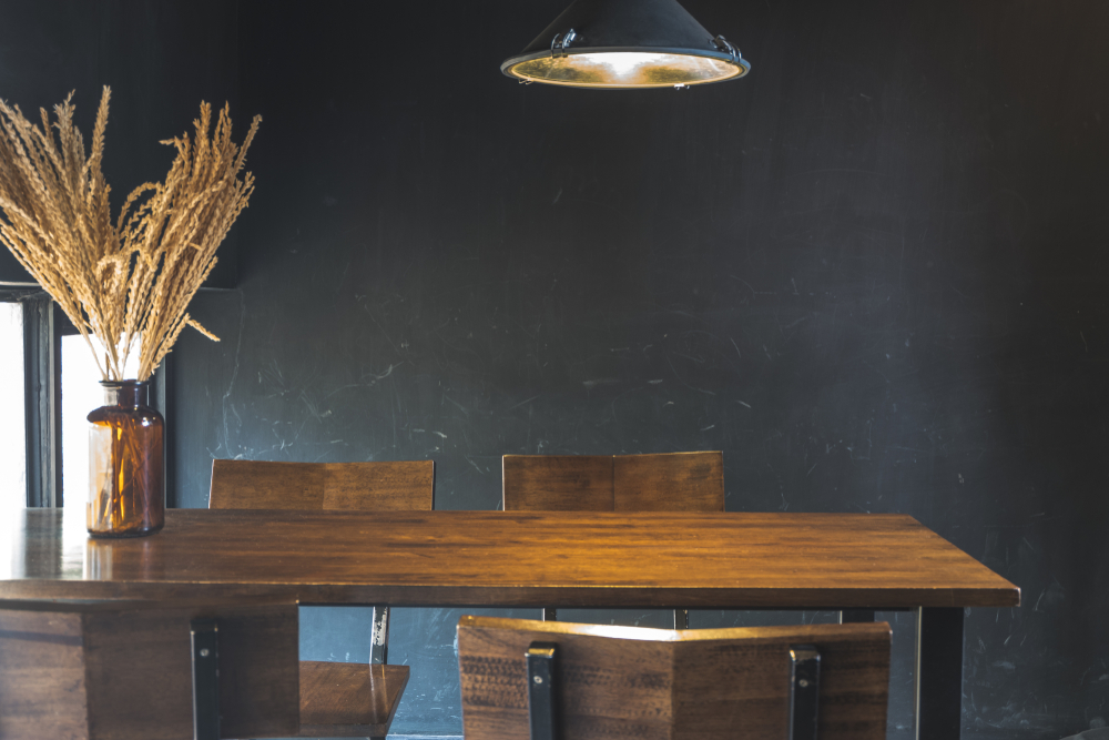
Masculine rooms tend to have strong, simple lines and rarely contain curvy, intricate pieces.  When making selections, choose pieces with simple, angular elements.  Geometric shapes play a big role in the design; think graphic rugs and artwork.  Fabrics with a classic pinstripe, plaid or herringbone pattern give a nod to menswear and create interest without feeling fussy.  Remember when accessorizing, less is more!  dark and moody dining room

Texture

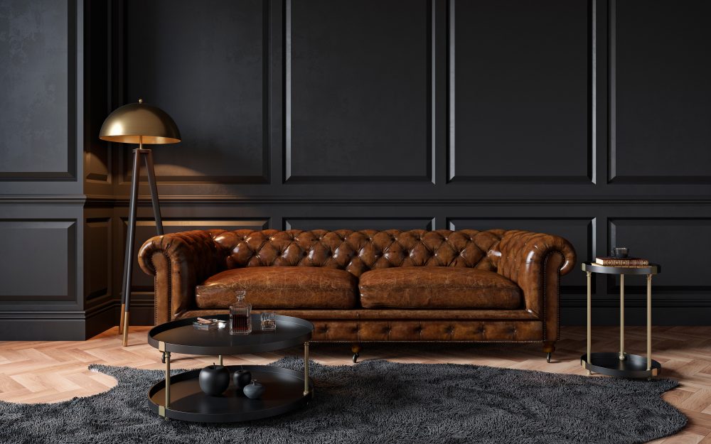
The blending of rough and smooth surfaces will help you achieve a masculine look.  Blend natural materials such as stone or wood with sleek metals or glass like a polished light fixture or accent table.  Leather is the quintessentially masculine element of any space.  It can add such warmth, texture and richness to a space.  Try adding a chair or sofa for impact or simple leather pulls or a pouf for a lighter touch.masculine interior with leather chesterfield