2017 Color of the Year Forecasts

What a difference a year makes! Every year the leading paint companies release their color trend predictions for the upcoming year. Last year we saw a white from both Benjamin Moore and Sherwin Williams, a blush pink and purple from Pantone and an aloe green from PPG. While none were exactly the same they all had a light fresh quality about them. This year, all bets are off!

PANTONE’S COLOR OF THE YEAR

REFRESHING. REVITALIZING. NEW BEGINNINGSlight shining through trees
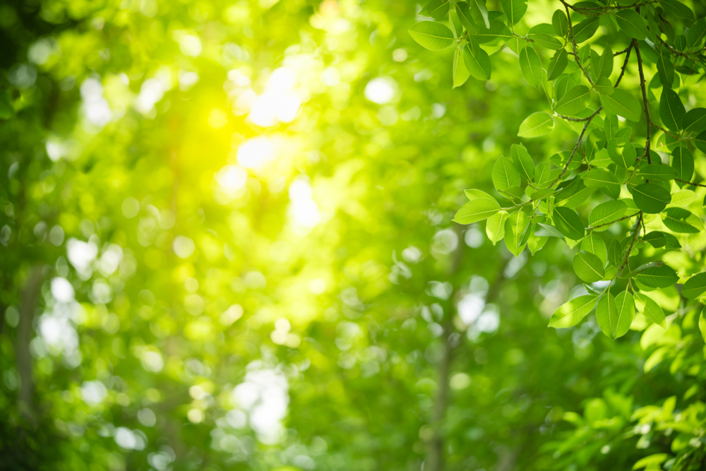
Greenery is described as “a fresh and zesty yellow-green shade that evokes the first days of spring when nature’s greens revive, restore and renew.”

SHERWIN-WILLIAMS COLOR OF THE YEAR

MODERN. CLASSIC. NEUTRALwood bark on a tree
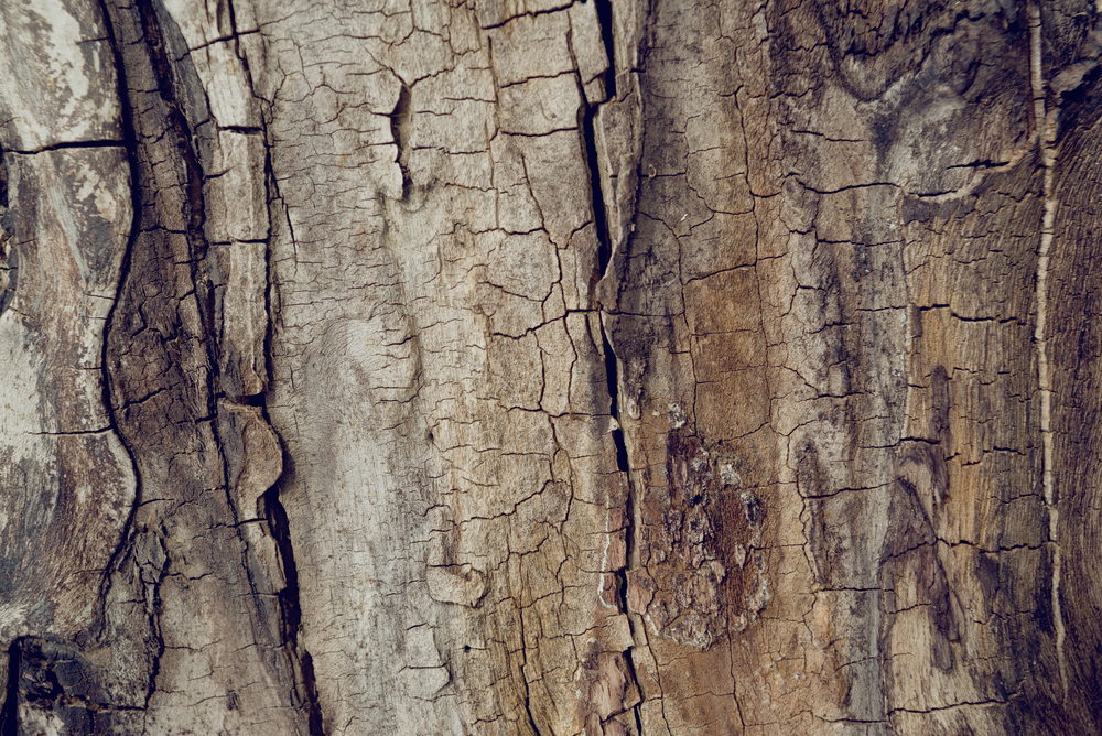
Poised Taupe is an earthen brown combined with conservative grey and the result is a weathered, woodsy and complex neutral that celebrates the imperfections and authenticity of a well-lived life.

BENJAMIN MOORE COLOR OF THE YEAR

MYSTERIOUS. PASSIONATE. ALLUSIVE.purple ink
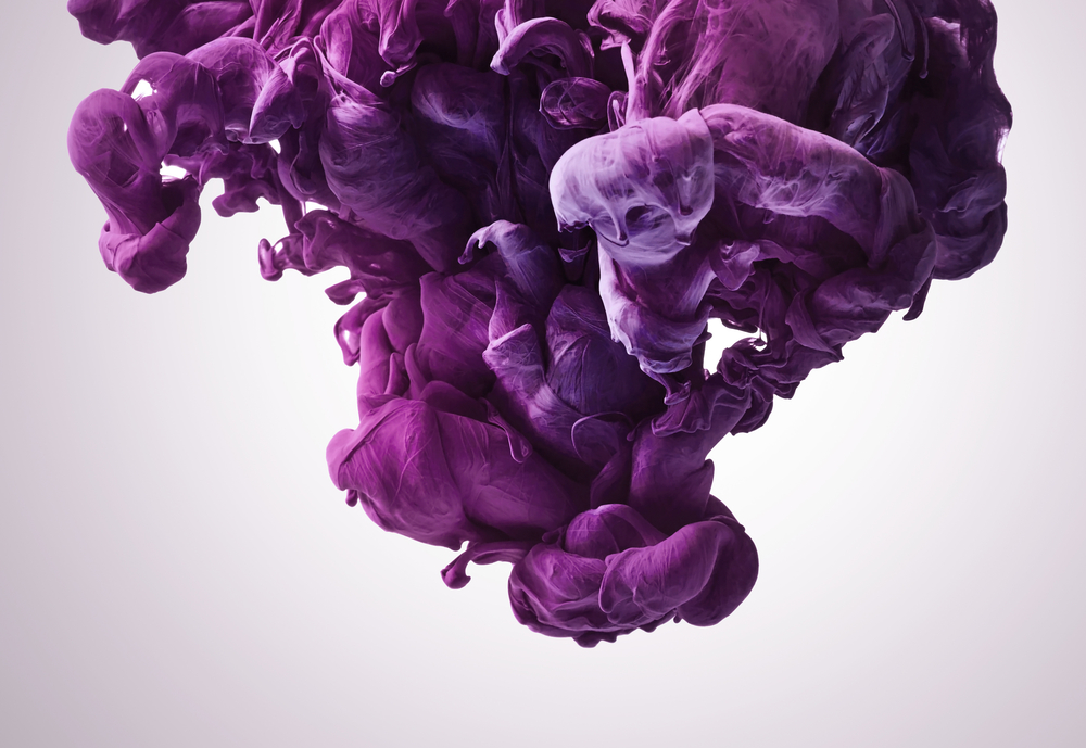
Benjamin Moore Creative Director, Ellen O’Neill, described Shadow as sophisticated, provocative and poetic, it can bring energy to a space or harmony and a moment of respite.

PPG COLOR OF THE YEAR

DEPTH. LUXURY. PAMPERING.evening sunset
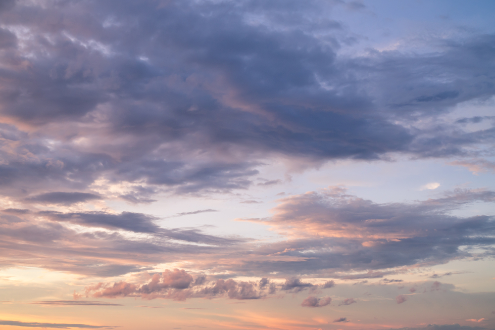
Violet Verbena is a moody purple with a chameleon-like presence that adapts to surrounding environments and complements a variety of design aesthetics, from playful rooms to tranquil spaces.

We would love to know you thoughts on the 2017 color forecasts. Which do you love? How will you use it?

For inspiration on how to incorporate these colors in your interiors check out our 2017 Color Trends Board on Pinterest.

Sherwin Williams 2017 Color Forecast

Every year I look forward to Sherwin-Williams ColorMix, hosted in St. Louis, at KDR Designer Showroom. This event is the official unveiling of the projected color trends for the upcoming year. I was so inspired by the presentation I thought it would be fun to share the 4 palettes with you.

NOIR

It’s among our most precious commodities: night. We’re craving a refuge from urban streetlights and glowing screens, space to turn our gaze inward and recharge the spirit. Mindful melancholy is fueling a new romanticism marked by medieval patterns, revived customs and bittersweet beauty. The Dutch masters knew the secret: dark hues set a dramatic stage for sensuous luster. This palette is rich with vine-ripened fruits, Nordic blues, moody neutrals and golden yellows.

HOLISTIC

Sustainable design and radical transparency are the new standards. As our daily transactions move further into the cloud, acquiring experiences is becoming preferable to buying more things. “Doing good” is the new looking good, and it’s taking the form of “voluntourism,” healing retreats and eco-travel. We’re in pursuit of an elusive ideal: a fair luxury. The roads of this journey are lined with arctic neutrals, blush rose and wild browns.

INTREPID

The virtual and the real are blurring in the form of seamless commerce and “office anywhere” collaboration. Impatient for social and political change, we’re reinventing ourselves first. Identity has never been more fluid. “You do you” is the mantra of a generation primed for self-expression, cheered on by their own #squad and tossing aside old categories. There’s a feisty energy to our present moment, arriving in fiery tones and vibrant, kimono colors.

UNBOUNDED

Global immigration is redefining borderlands, national identity and our sense of coexistence. We’re all citizens of the world now. Brands are becoming more purpose-driven, communities more connected. Design is adapting to more diverse populations. Overconsumption is, well, over. We’re more likely to invest in the best we can afford — crafted and customized — and then keep it forever. Global consciousness is a mural painted in earthy mustards, ocean blues, corals and mud.

Visit Srote & Co on Pinterest to view our boards dedicated to each palette.