Living Well – SuperPaint by Sherwin Williams

To say the global pandemic has affected our everyday lives would be an understatement. Chances are you have made updates to your residence or are considering home improvement projects to support the activities that are now taking place inside the home. The interior design industry is paying attention and products are being introduced to support our new normal. In this series, Living Well, we will feature products and materials that support our lifestyles, health and well-being.

Today we introduce the aptly titled Living Well Collection of paint from Sherwin Williams. A special thank you to our Designer Account Executive – Katie Moses and Sherwin Williams for the use of their images and slides in this post!

Living Well Collection by Sherwin Williams

The Living Well collection is comprised of 540 neutral to mid-tone colors. If that is too many options for you, 132 inspiring hues have been curated into 11 color palettes to invite a sense of comfort and well-being in your home.
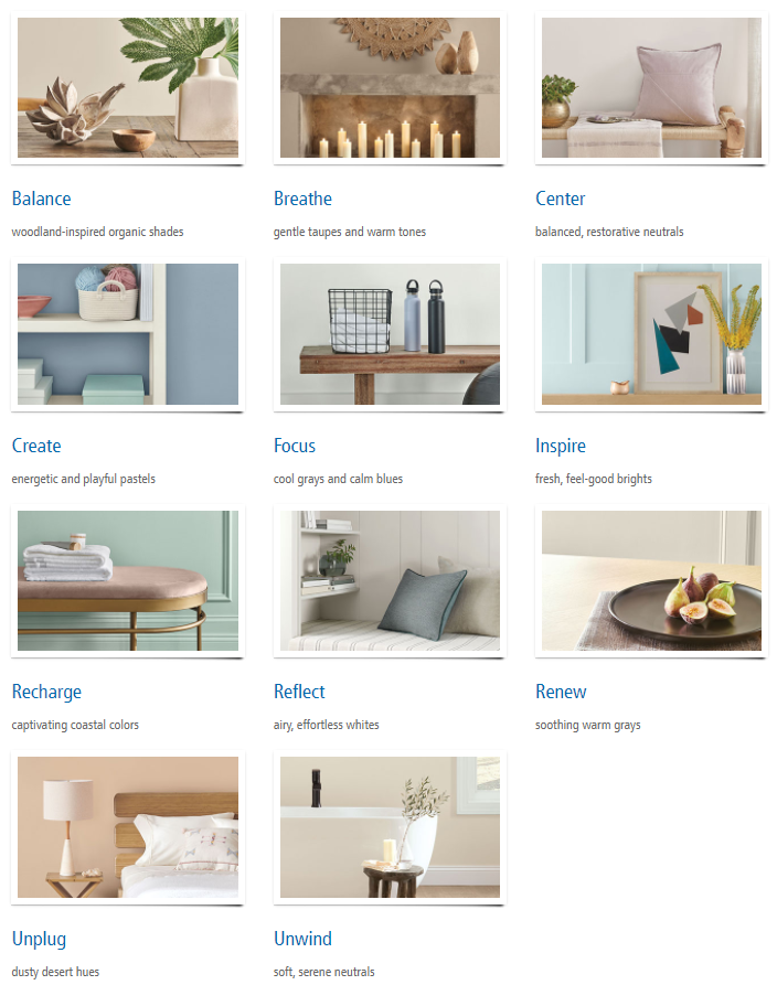
Living Well Collection by Sherwin Williams

The Living Well Collection is offered as part of their SuperPaint product line featuring 2 different technology options – Sanitizing Technology and Air Purifying Technology.

SuperPaint with Sanitizing Technology

This interior latex microbicidal paint is the first EPA-registered microbicidal and proven to kill 99.9% of E. coli, MRSA, and Staph on painted surfaces within two hours of exposure. If that wasn’t impressive enough, it continues to kill 90% of bacteria for up to four years, even after repeated contamination.
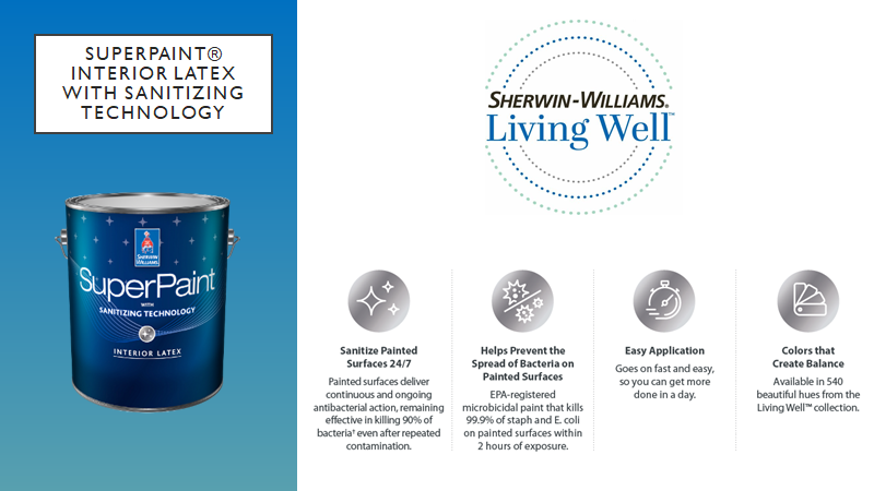
Interior latex paint with sanitizing technology

SuperPaint with Air Purifying Technology

This interior acrylic, zero VOC formula, contributes to better indoor air quality. Thanks to its innovative technology SuperPaint with Air Purifying Technology can actually reduce the VOC levels from other interior materials such as carpeting, cabinetry and fabrics. Want more good news? It is even effective on unwanted household odors!
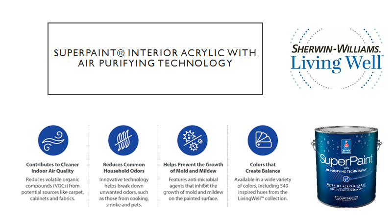
Interior acrylic paint with air purification

As interior designers, we know the immediate impact a fresh coat of paint can make. The fact that it can now make a positive impact on our health and well-being is truly innovative!
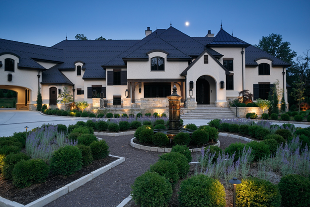
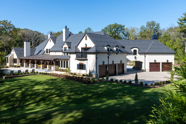
Project Spotlight – Ladue Grand Rue

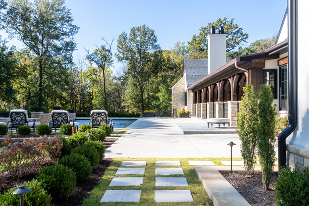
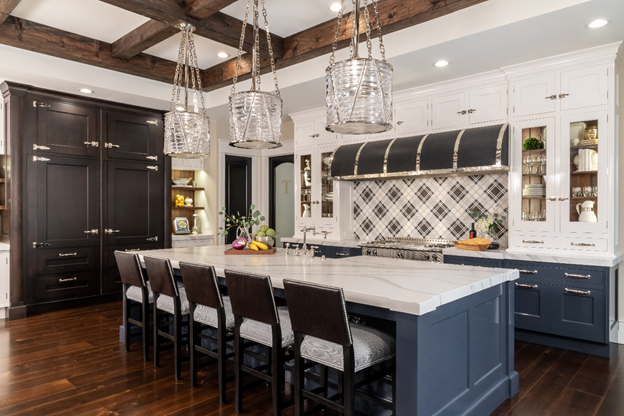
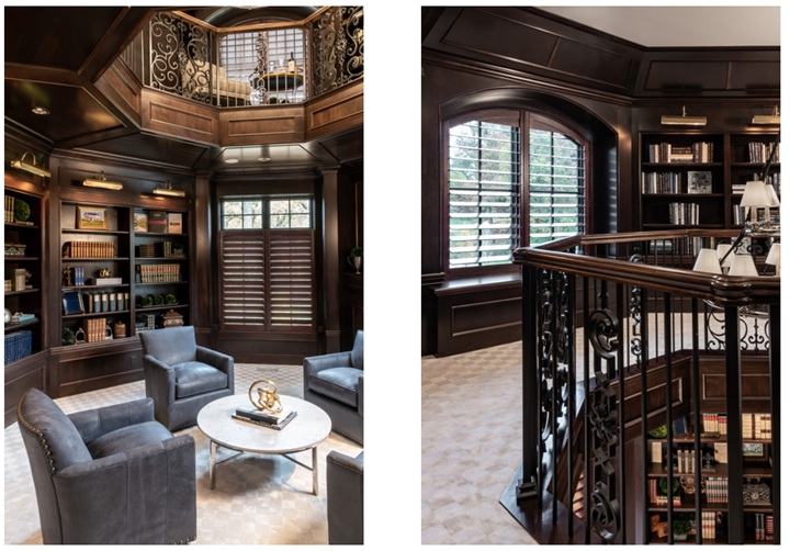
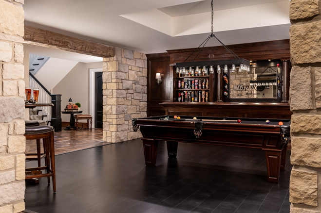
Today we feature a Srote & Co project, completed in 2019, that represents the partnership between our architectural and interior design divisions. Srote & Co is proud to have been involved in this project from inception through completion. The result is Ladue Grand Rue, a truly custom residence that reflects our client and their lifestyle. Architecture and Interior Design by Srote & Co Architects and built by REA Homes.

EXTERIOR

Custom home architecture by Srote & Co Architects
Custom home design in St Louis MO
Pool deck of custom home

INTERIOR

Custom kitchen interior by Srote & Co Architects
Custom home library and study interior design
Custom lower level interior design
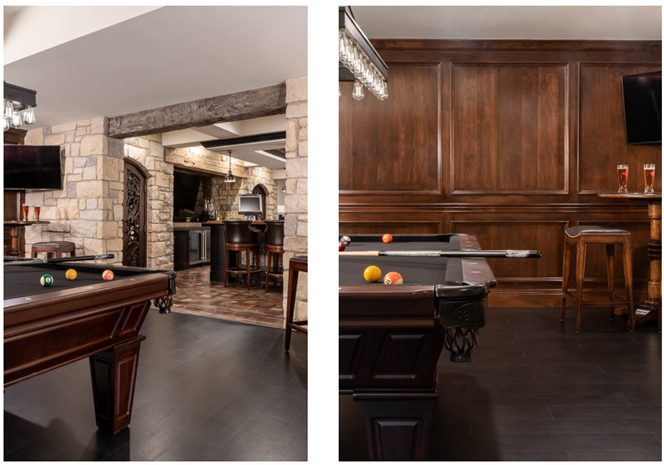
Lower level billiards room design
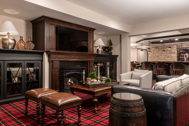
Lower level lounge interior design
FOR MORE DETAILS AND PROJECT IMAGES – visit the Interior Design Portfolio at SroteCo.com.

2017 Interior Trends Follow-Up

Every year I relentlessly scour my favorite magazines, manufacturers and online resources for new introductions in search of the next years “Next Big Thing”. It is that time of year again when we take a look back at our Interior Design Trends to see how well we did with our 2017 predictions. Stay tuned for our 2018 Forecast coming in January!

MIXING & MATCHING PATTERNS – While we did see mixing and matching it was mostly a textural difference than the bright, vibrant interiors featured below. As we continue to move through the gray and white craze we will certainly start to see some of these pops of colors making their way into our homes in 2018. HINT – Mixing and matching patterns becomes easier when anchored by a monochromatic or neutral backdrop.

ART-INSPIRED WALLPAPER – I should have said ALL WALLPAPER! 2017 was the year of wallpaper at Schaub + Srote. Large scale prints, grasscloth, and metallic finishes/embellishments made their way into almost every one of our projects. If you haven’t considered using a wallpaper recently I encourage you to take a look. It seems we all have a wallpaper memory of our childhood. Mine happens to be of my kitchen covered in country blue bows with ducks(and matching canisters for the countertop). I promise you these are not the papers that haunt your past!

NAVY AND DARK GREEN INTERIORS – It would be an understatement to say that Navy was a HIT! I really hope that the Dark Green picks up in popularity as we make our way through 2018. Both work great as a neutral and create a drama that can’t be found in brighter tones of the same colors. Although these were not selected as the color of the year by the leading paint companies they will be EVERYWHERE!

DON’T SHOOT THE MESSENGER!

Here are a few of the design trends we will say goodbye to in 2017 –

POLISHED METALS – So many amazing finishes were introduced to the market in 2017- all with a matte or brushed finish. Aged Pewter, Carbon, Architectural Bronze and Shadow are just a few that are featured in the new Waterworks catalog. Polished finishes haven’t completely disappeared they are just being layered with other finishes for visual interest.

“Warm metals like copper, brass and rose gold will continue to be on trend for autumn/winter 2016, but as we move into summer 2017 you’ll see a shift away from this super polished look,” says Diane Cocksey, Senior Interior Decorator at Freedom. “I expect you’ll see a more industrial aesthetic, with black steel and burnished metals taking over the home.”

MARBLE HOUSEWARES – While I do not see the marble countertop trend coming to an end anytime soon, I think we have cycled through the marble-everywhere phase. I have to admit I am a sucker for a marble and wood serving platter or cutting board but I am ready for the next big thing in housewares. Stay tuned for our 2018 Trend Forecast to see what that will be.

While marble is all the rage in the mass-produced homewares market, we can soon expect a sharp decline in interest. In 2017, be on the lookout for earthy textures like timber, clay and wicker to take its place.

FIDDLE LEAF FIGS ARE OUT, OLIVE TREES ARE IN – The trend is certainly still leaning toward bringing the outside in. I  find the Fiddle Leaf Fig to be extremely popular and I happen to be a fan. Incorporating natural elements in your space is a designer must have. Just be sure to pick whatever reflects your style and fits the scale of your space. Those are the only rules.

I am struggling with this one! Fiddle Leaf Figs are EVERYWHERE. EVERY. WHERE. Cost, maintenance and lifespan are cited as the major factors for the decline in popularity.

How do you think we did on these predictions for 2017.

Which trends did you love or leave?

Any prediction for 2018?