2018 Interior Trends

The trend forecast is always a bit tricky for me. I am not a designer that necessarily puts a lot of stock in the latest design trends. Actually, I don’t even have a specific design style I subscribe to. While trends are a great way to introduce consumers to products and materials they may not have had previous exposure to, at the end of the day your home should be an environment that reflects who you are and how you live. In years past I have turned to furniture and accessory markets, manufacturers websites, online publications and local showrooms to see what is on the design horizon. This year I am going to mix it up. My 2018 Interior Trend forecast is based on what I am experiencing with my clients in the St Louis Metro area.

LIGHTING

Lighting plays a major role in every project. In fact, one of the first considerations in the architectural design process is determining how the residence will be situated on the site, taking into consideration the orientation of the residence in relationship to the sun path. In addition to this natural lighting there are 3 main types of artificial lighting categories that should be incorporated. Check out our blog post A Well Lit Interior for more information on the different layers of lighting necessary for a properly illuminated space.

2 Trends In Lighting –

One is the embracing of LED technologies. I have to admit even I was intimidated by the ever-changing world of LED technology. We experienced such a rapid evolution in LED that just when you thought you knew what you were talking about the next greatest advancement had happened. I think we have finally begun to realize the potential and capabilities of LED and as a result have found the way to shape the conversation around the technology. Here are just a few of the ways LED is changing the lighting industry and our interiors.
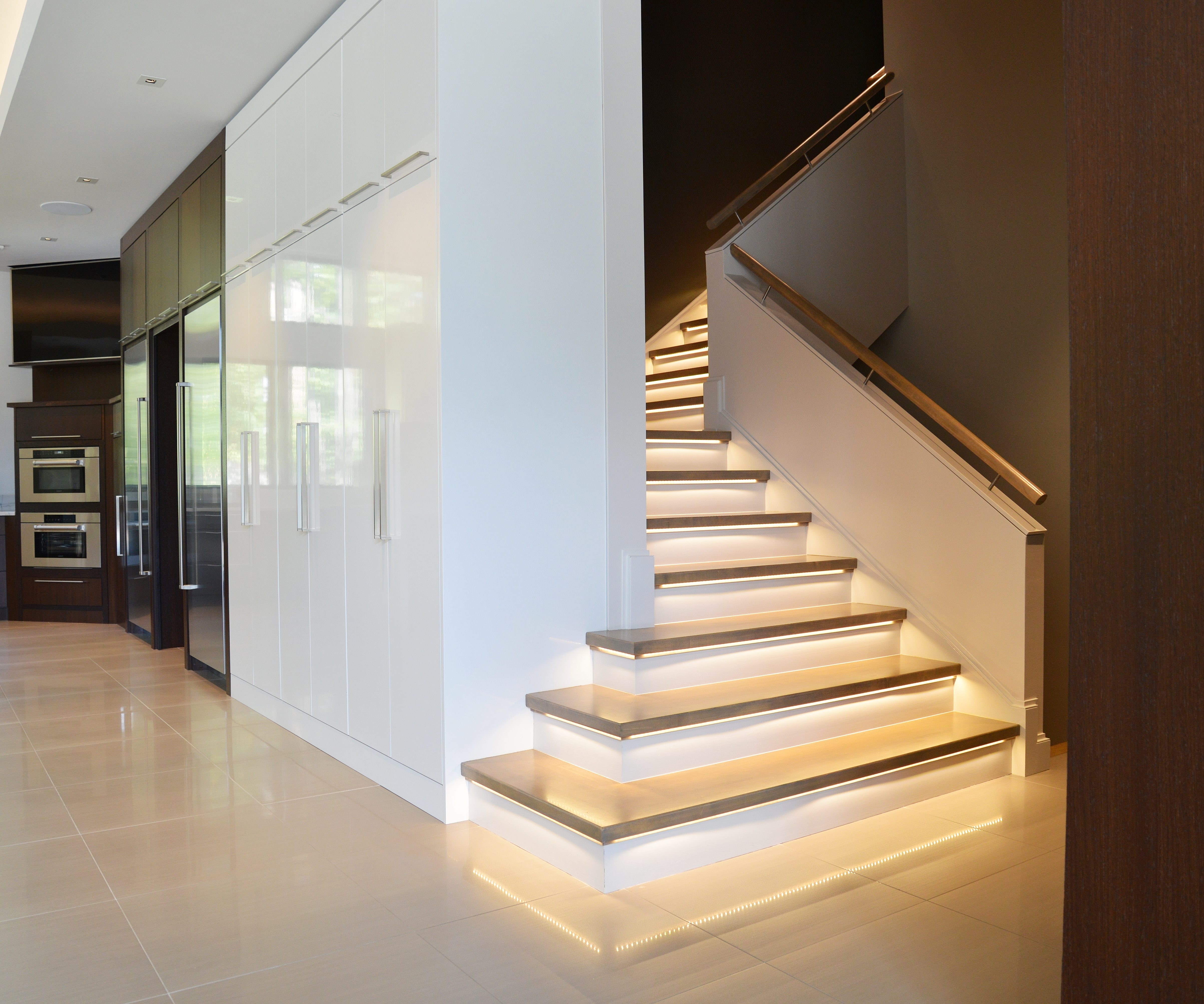
LED tape lighting on stairs

Architecture by Srote & Co Architects

The other direction I see is maximizing the use of recessed lighting throughout a residence as the ambient source of light, and choosing your moments for a statement fixture. Areas that used to be a traditional location for a flush mount or pendant are now replaced with a recessed can light and sconces have become common place in bathrooms in lieu of the expected light bar.

MIXING FINISHES

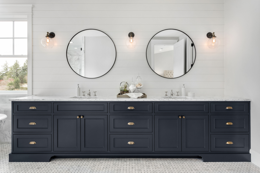
One of the most often asked questions I get during the interior selection process is in regard to matching metal finishes. Do my door knobs need to match my plumbing fixtures? Should my plumbing and lighting fixtures be the same finish? It really depends on your aesthetic and the metals being considered. This bathroom is a perfect illustration of mixing gone right!vanity featuring mixed metal finishes
STATEMENT MIRRORS

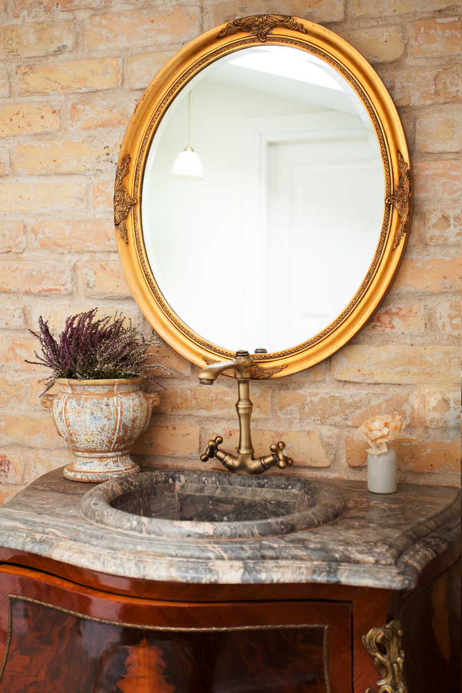
Statement mirrors are a great way to add personality to any space and come in all sizes and price points. Besides the obvious function they provide, mirrors are a great way to expand spaces and break up the use of art in an area. The variety of frame styles and materials really allow you to make a statement without overpowering a space. Wayfair and Home Goods are two of my go-to resources when looking for readily available options. If you are not in a hurry Uttermost and Arteriors are great resources to explore.decorative accent mirror
2nd floor Laundry Room

I can’t believe it took us so long to realize that in a typical 1-1/2 story or 2 story home the majority of the laundry comes from the 2nd level. Why we spent years dragging all of it up and down the stairs is beyond me. In this scenario, the mudroom on the main level becomes dedicated to cubbies for storage and a planning zone with a stackable washer and dryer located in the owner’s suite. Laundry rooms are similar to formal powder rooms in that there are no rules when it comes to decorating them. It does not have to flow or communicate with the rest of the home so it is a fun place to take a risk. While laundry may not be the most exciting task doing it in one of these rooms sure would make it more enjoyable.

One’s To Watch

I can’t wait to see what 2018 has in store for us! I have a few developing trends on my radar and am looking forward to seeing how much momentum they gain over the next 12 months. Our homes and the products we use in them continue to adapt and change to accommodate our fast paced lifestyles. With a renewed focus on health and well-being we are already seeing steam technology for cooking gaining popularity in our kitchen designs and the amazing health benefits it provides undeniable. Yoga and Pilates rooms, massage rooms, home gyms and saunas are becoming common place in our custom residences. We will see if it makes the list next year. Stay tuned!

Are you all ready incorporating any of these in your interior? We would love to see your space. If not, which one are you likely to try in 2018?

2017 Interior Trends Follow-Up

Every year I relentlessly scour my favorite magazines, manufacturers and online resources for new introductions in search of the next years “Next Big Thing”. It is that time of year again when we take a look back at our Interior Design Trends to see how well we did with our 2017 predictions. Stay tuned for our 2018 Forecast coming in January!

MIXING & MATCHING PATTERNS – While we did see mixing and matching it was mostly a textural difference than the bright, vibrant interiors featured below. As we continue to move through the gray and white craze we will certainly start to see some of these pops of colors making their way into our homes in 2018. HINT – Mixing and matching patterns becomes easier when anchored by a monochromatic or neutral backdrop.

ART-INSPIRED WALLPAPER – I should have said ALL WALLPAPER! 2017 was the year of wallpaper at Schaub + Srote. Large scale prints, grasscloth, and metallic finishes/embellishments made their way into almost every one of our projects. If you haven’t considered using a wallpaper recently I encourage you to take a look. It seems we all have a wallpaper memory of our childhood. Mine happens to be of my kitchen covered in country blue bows with ducks(and matching canisters for the countertop). I promise you these are not the papers that haunt your past!

NAVY AND DARK GREEN INTERIORS – It would be an understatement to say that Navy was a HIT! I really hope that the Dark Green picks up in popularity as we make our way through 2018. Both work great as a neutral and create a drama that can’t be found in brighter tones of the same colors. Although these were not selected as the color of the year by the leading paint companies they will be EVERYWHERE!

DON’T SHOOT THE MESSENGER!

Here are a few of the design trends we will say goodbye to in 2017 –

POLISHED METALS – So many amazing finishes were introduced to the market in 2017- all with a matte or brushed finish. Aged Pewter, Carbon, Architectural Bronze and Shadow are just a few that are featured in the new Waterworks catalog. Polished finishes haven’t completely disappeared they are just being layered with other finishes for visual interest.

“Warm metals like copper, brass and rose gold will continue to be on trend for autumn/winter 2016, but as we move into summer 2017 you’ll see a shift away from this super polished look,” says Diane Cocksey, Senior Interior Decorator at Freedom. “I expect you’ll see a more industrial aesthetic, with black steel and burnished metals taking over the home.”

MARBLE HOUSEWARES – While I do not see the marble countertop trend coming to an end anytime soon, I think we have cycled through the marble-everywhere phase. I have to admit I am a sucker for a marble and wood serving platter or cutting board but I am ready for the next big thing in housewares. Stay tuned for our 2018 Trend Forecast to see what that will be.

While marble is all the rage in the mass-produced homewares market, we can soon expect a sharp decline in interest. In 2017, be on the lookout for earthy textures like timber, clay and wicker to take its place.

FIDDLE LEAF FIGS ARE OUT, OLIVE TREES ARE IN – The trend is certainly still leaning toward bringing the outside in. I  find the Fiddle Leaf Fig to be extremely popular and I happen to be a fan. Incorporating natural elements in your space is a designer must have. Just be sure to pick whatever reflects your style and fits the scale of your space. Those are the only rules.

I am struggling with this one! Fiddle Leaf Figs are EVERYWHERE. EVERY. WHERE. Cost, maintenance and lifespan are cited as the major factors for the decline in popularity.

How do you think we did on these predictions for 2017.

Which trends did you love or leave?

Any prediction for 2018?

Alternative Windows and Doors

Today I want to discuss a newer wave of doors and windows that steer clear of the traditional looks and functionality we’ve seen in the past. Pivot, garage, and folding doors and windows have become hugely popular over the last 5 or so years and I believe the trend will continue to thrive. They not only offer your home design a unique, custom look, they allow for unobstructed views to the outdoors. Read about each option and see some of our favorite photos below.

PIVOT DOORS

Instead of hanging from hinges on a door frame as a traditional door would, pivot doors rotate on a set of pins mounted at the top and bottom of the door. Pivot doors appear to float in their frames and can provide a clean, modern and luxurious look for your space. These doors typically have a generous opening, much wider than the traditional doors you’re used to seeing.

GARAGE DOORS

Garage doors are no longer limited to protecting your vehicle. “Pull-up” doors as they are also called are a great way to create flexible spaces for socializing and letting the outdoors in! Whether acting as a retractable living space partition between rooms, as a window wall or exterior door alternative, garage doors are a unique feature and function to a home’s design.

FOLDING DOORS & WINDOWS

In traditional sliding door applications we are left with half of the door opening being blocked by a closed door. Folding, accordion-style doors allow for an almost completely open door frame. This type of door really allows the outside to become an extension of the home. They look especially beautifully when they span the entire length of a wall. Another great look is incorporating folding glass windows for a kitchen pass-through/walk-up bar!

What are your thoughts on these alternatives? Let me know in the comments!

2017 Winter Markets

Every January, buyers flock to the 3 big home markets: Atlanta, Dallas, and Vegas. While I didn’t attend this year I find that it’s always fun to look through Instagram hashtags and following along with Instagram stories! It really helps me get a sense of what’s to come, interiors-wise, in the year! I found many common themes and lots of beautiful eye candy!


BOLD COLOR

I saw a lot of rich jewel tones from Worlds Away.

This dark green paint color was one of our predictions for 2017! Check out our favorite dark green paint colors and accessories here!


LAYERED WHITES/NEUTRALS

Layering neutrals is one of my favorite looks. These spaces below are full of interest and prove that neutral doesn’t have to mean boring!

I love the legs on this Tritter Feefer dining table!


TONS OF TEXTURE

This ties in with the layered neutrals above and is the key to achieving the look. I saw a lot of textured pottery and special furniture pieces.


BLUSH

It seems like this shade is popping up everywhere in accessories and accent furniture!

https://www.instagram.com/p/BPk_DrplcGL/

How cool is the faux bois patterned pillow?!

https://www.instagram.com/p/BPpq01pDNlS/


BOTANICAL AND FLORAL MOTIFS

I love the detail and texture of this Palecek magnolia-inspired mirror.


BRIAN PATRICK FLYNN for CRYSTORAMA

Brian Patrick Flynn’s lighting line with Crystorama is so beautiful! He was kind enough to send me some professional images to share with you!

The Hulton – This collection has an industrial vibe and features a “cage within a cage” design. Available in 3 different sizes in a matte black finish.

The Alston – This collection features a heavy metal drum shade with a thick, rectangular chain! Available in 3 different sizes with matte black or matte white finishes. (The white option has a beautiful brass interior!)

The Hurley – This collection is a modern take on a classic lantern design. The frame is super thick and looks so luxurious in the polished nickel finish.

The Truax – This collection is available in a modern style (simple globe) and more traditional style (metal band). It’s available in various sizes, including a huge 30″x 38″ version!


Did any trends or pieces catch your eye? If you want to see more check out these accounts and hashtags on instagram:

2017 Color of the Year Forecasts

What a difference a year makes! Every year the leading paint companies release their color trend predictions for the upcoming year. Last year we saw a white from both Benjamin Moore and Sherwin Williams, a blush pink and purple from Pantone and an aloe green from PPG. While none were exactly the same they all had a light fresh quality about them. This year, all bets are off!

PANTONE’S COLOR OF THE YEAR

REFRESHING. REVITALIZING. NEW BEGINNINGSlight shining through trees

Greenery is described as “a fresh and zesty yellow-green shade that evokes the first days of spring when nature’s greens revive, restore and renew.”

SHERWIN-WILLIAMS COLOR OF THE YEAR

MODERN. CLASSIC. NEUTRALwood bark on a tree

Poised Taupe is an earthen brown combined with conservative grey and the result is a weathered, woodsy and complex neutral that celebrates the imperfections and authenticity of a well-lived life.

BENJAMIN MOORE COLOR OF THE YEAR

MYSTERIOUS. PASSIONATE. ALLUSIVE.purple ink

Benjamin Moore Creative Director, Ellen O’Neill, described Shadow as sophisticated, provocative and poetic, it can bring energy to a space or harmony and a moment of respite.

PPG COLOR OF THE YEAR

DEPTH. LUXURY. PAMPERING.evening sunset

Violet Verbena is a moody purple with a chameleon-like presence that adapts to surrounding environments and complements a variety of design aesthetics, from playful rooms to tranquil spaces.

We would love to know you thoughts on the 2017 color forecasts. Which do you love? How will you use it?

For inspiration on how to incorporate these colors in your interiors check out our 2017 Color Trends Board on Pinterest.

Sherwin Williams 2017 Color Forecast

Every year I look forward to Sherwin-Williams ColorMix, hosted in St. Louis, at KDR Designer Showroom. This event is the official unveiling of the projected color trends for the upcoming year. I was so inspired by the presentation I thought it would be fun to share the 4 palettes with you.

NOIR

It’s among our most precious commodities: night. We’re craving a refuge from urban streetlights and glowing screens, space to turn our gaze inward and recharge the spirit. Mindful melancholy is fueling a new romanticism marked by medieval patterns, revived customs and bittersweet beauty. The Dutch masters knew the secret: dark hues set a dramatic stage for sensuous luster. This palette is rich with vine-ripened fruits, Nordic blues, moody neutrals and golden yellows.

HOLISTIC

Sustainable design and radical transparency are the new standards. As our daily transactions move further into the cloud, acquiring experiences is becoming preferable to buying more things. “Doing good” is the new looking good, and it’s taking the form of “voluntourism,” healing retreats and eco-travel. We’re in pursuit of an elusive ideal: a fair luxury. The roads of this journey are lined with arctic neutrals, blush rose and wild browns.

INTREPID

The virtual and the real are blurring in the form of seamless commerce and “office anywhere” collaboration. Impatient for social and political change, we’re reinventing ourselves first. Identity has never been more fluid. “You do you” is the mantra of a generation primed for self-expression, cheered on by their own #squad and tossing aside old categories. There’s a feisty energy to our present moment, arriving in fiery tones and vibrant, kimono colors.

UNBOUNDED

Global immigration is redefining borderlands, national identity and our sense of coexistence. We’re all citizens of the world now. Brands are becoming more purpose-driven, communities more connected. Design is adapting to more diverse populations. Overconsumption is, well, over. We’re more likely to invest in the best we can afford — crafted and customized — and then keep it forever. Global consciousness is a mural painted in earthy mustards, ocean blues, corals and mud.

Visit Srote & Co on Pinterest to view our boards dedicated to each palette.

The New Neutral

Over the past year or so, it seems like dark green interiors have been popping up left and right and the hue shows no signs of slowing down. It is one of the top design trends predicted for 2017. Think of it as the “new navy.”

This moody color works well with both traditional and modern decor. Working as a dramatic neutral it really pairs well with almost ANY color.  However, it truly shines when paired with other neutrals.  Add in beautiful wood tones, camel leather, natural linens and warm brass tones for a winning combination.

This is certainly a color you need to test out before making a final selection. As you should always do, purchase a few sample colors and paint large squares on each wall of the room. Live with it for a couple days and take note of how the color looks throughout the day. Different lighting conditions will greatly affect how the color reads in your home. For a more reserved take on the trend, paint a piece of furniture or add a pop of the color using a piece of art or pillow!

So what is your take on this color? Love it? Hate it? Sound off in the comments!

Trend Watch – Welcome To The Jungle

banana leaf printI don’t know about you but I am currently loving the resurgence of this tropical trend in decor and accessories. And its a good thing because I can’t open a magazine or my Instagram feed without being overwhelmed with designs or accessories embracing this element.

DON’T CALL IT A COMEBACK

The banana leaf was made popular in the 1940’s when decorator Don Loper designed and installed over 5 1/2 miles of the now iconic, Martinique wallpaper, in the Coffee Room and the hallways at The Beverly Hills Hotel. At the same time Dorothy Draper was beginning a major renovation at The Greenbrier Hotel in West Virginia giving us the iconic Brazilliance wallpaper. Truly standing the test of time, the wallpapers remain in both hotels today.

FASHION & DECOR COLLIDE

While there used to be an almost 5 to 6 year lag from the runway to interior showrooms we now see an immediate correlation between the two. This is due mostly to the popularity of blogging, social media and communication between the creative minds in each respective field. Today you can find banana leaves on everything from iPhone cases to swimwear.

What are your thoughts on this tropical inspired trend? We would love to see how you are embracing this in your everyday life!